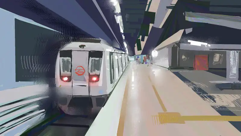
Traveling within a city usually tends to become a hassle specially if it’s far distance, you’re an outsider and you’re on a budget. Commuting in the capital was largely a delight thanks to the lovely colorful strands of noodles spread all over and even outside the city. Although the Pink line was close to my heart for more than one reason, I enjoyed the punctual Yellow line too. The older Blue, Red and Yellow routes run Bombardier rolling stock which have a very soothing warm lighting.
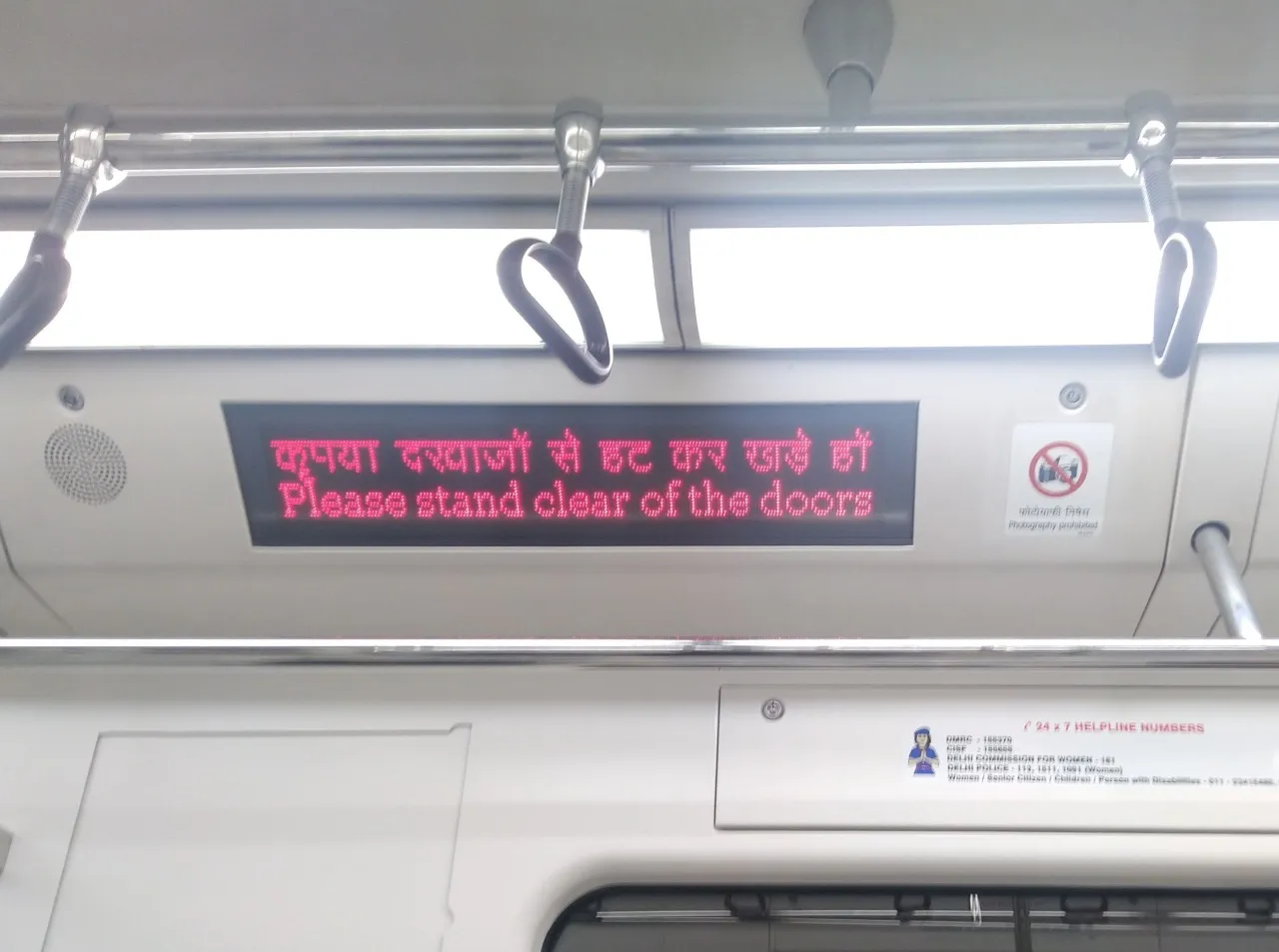
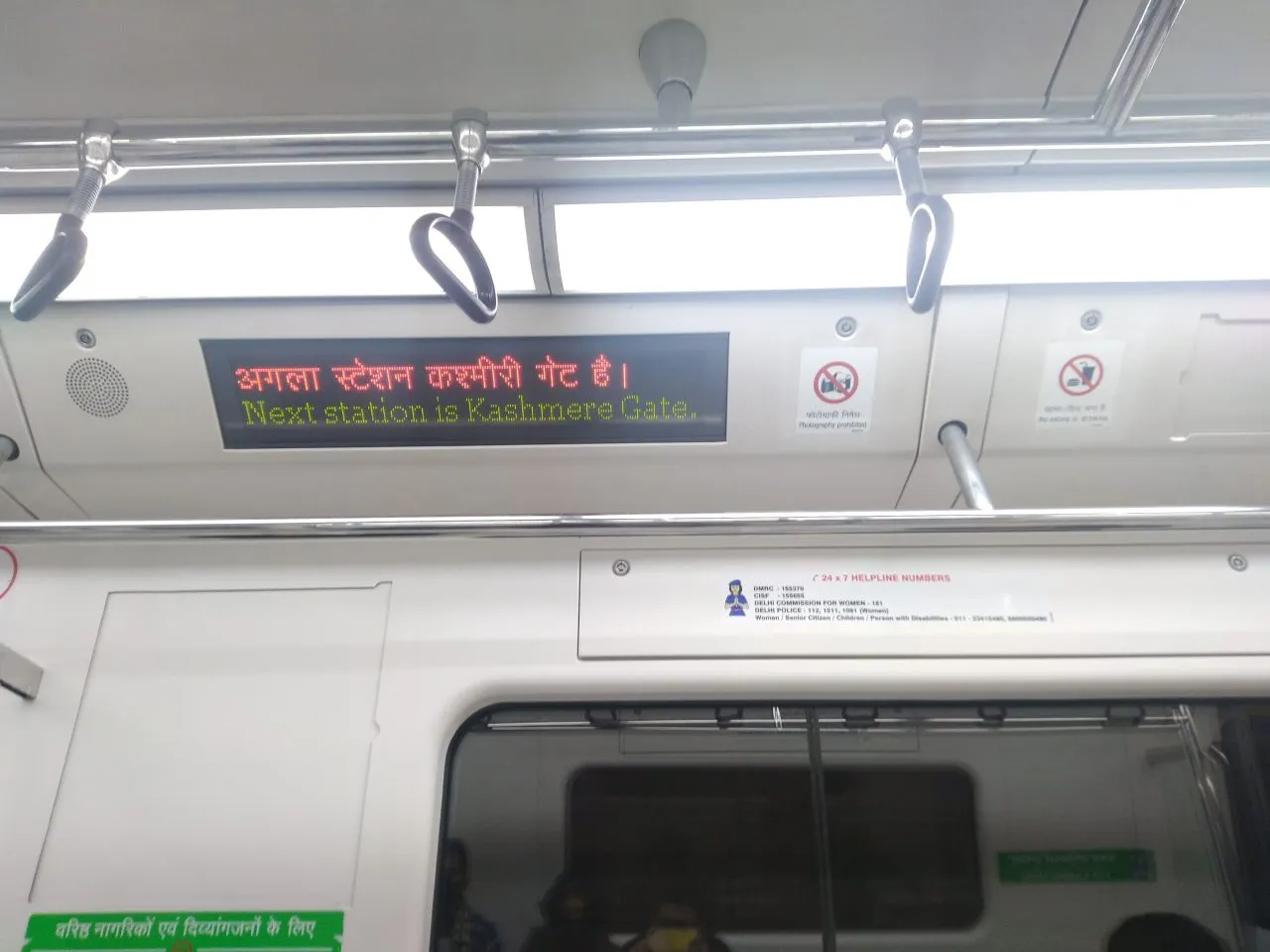
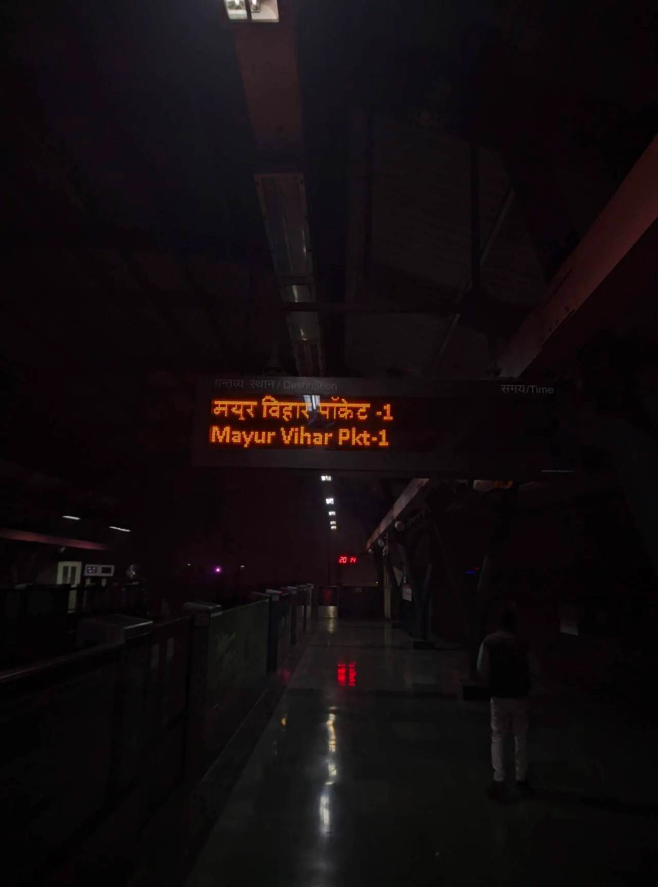
What’s more soothing were the dot matrix displays running serif typography. There was something deeply satisfying in watching the beautifully crafted letterforms glide across the displays specially when in comparison to the LCD panels in the more modern Hyundai Rotem rolling stock. Granted the LCD displays are much more functional, in displaying various kinds of information at the same time, being easy to customize and monetized but there is something about the carefully arranged dots in the serif display that just feels welcoming, warm and human.
The soft curves of the serif work better with the Devanagari script and the use of color seems far more deliberate.
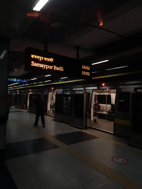
Other stations also use the dot-matrix display boards but with Sans Serif blood flowing in them. I’ll leave it to you to decide which one looks better.
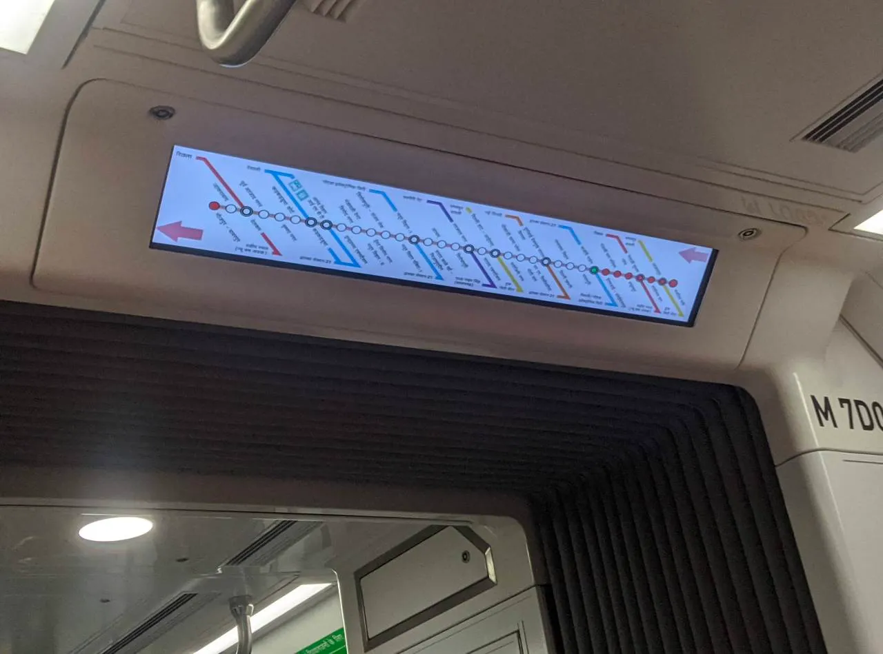
The LCD display onboard the newer trains can fit the entire route in one screen however, from far you’d struggle to read it properly.
Regardless of these chotu-motu pangey itthe-otthey, the system is super efficient, regular and well-maintained which easily makes it the backbone of Delhi’s public transportation system. Co-incidentally it has led me down the rabbit hole of well planned and efficient public transportation infrastructure of many other cities which hold enormous potential in moving people, reducing the number of cars on the road.
